|
This past month has been quite productive as I have finished two whole posters. The first one, Canadian Shield, was quite tedious at times but overall rewarding when it was completed. Out of the eight animals included on this poster, I spent the most time on the Canadian Lynx. There is a lot of variation in colors and textures on their fur, and their facial markings are very similar to a domestic tabby cat. I have had a little bit of experience with tabby cat markings from drawing my own cat and my aunt's cat, and I know how much time is spent on the face alone. So I hope the beauty and sassy nature of tabbies is conveyed well within the lynx. As you know, I quite enjoy drawing wolves, so I indulged myself and included a timber wolf on the poster. Though I have a lot of experience drawing wolves, it was my first time digitally painting one, and I love how the face and fur texture turned out. I revisited some pictures I took at Yamnuska Wolfdog Sanctuary to get the feel for the curious and mysterious energy that wolves tend to give off. At the sanctuary, they have a broad range of wolfdogs based on the percentage of wolf that each wolfdog contains. The ones with a higher percentage, like 60-80%, make for amazing references, but I did find a photograph of an actual pure timber wolf for the final reference. I also spent a ton of time completing the great horned owl as they have a lot of complicated patterns on the body and wings. I ended up simplifying a lot of the markings, but I believe it looks alright when it is zoomed out and the whole poster is in view. The second poster completed was of the Canadian Arctic. This one was honestly a very speedy process, I find that white animals or plants are very easy to do. And since this focuses on the arctic region, tons of animals and plants are white in order to blend in with their surroundings. I quite enjoyed being able to look at my Churchill pictures again to find references for the polar bear. I went on a zodiac boat tour up the river and ended up seeing two polar bears along the coastline. Due to it being July, we were told that we would be lucky to spot any as they aren't as frequently seen in the summer as in the winter months. So I totally wasn’t expecting to see any and didn’t end up bringing my big camera lens. The pictures I got were okay but did not do them the same justice that the powerful zoom on my big lens does. Luckily, my grandfather's camera was able to get in pretty close and he could stabilize them in the editing stage after the fact. He gave me permission to include them and use them as references, I think they turned out amazing considering the sighting was very unexpected. Instead of including a butterfly or a moth for the insect on this poster, I did an arctic bumblebee. I had no idea there was a separate species of bumblebee for the arctic regions of Canada and the other northern countries. But it does make sense as they would have to adapt to the harsh conditions and still pollinate the plants that do live up there. Another animal I had fun with was the narwhal. I got to experiment on how to best do the gray and white speckle markings along its back. I used a spray paint texture brush called ‘Driven Snow’ in order to get the randomized spots all over the body. I did that several times in different shades of white, gray, and black. And then I went over each layer and applied a gaussian blur in order to blend them into the body properly.
0 Comments
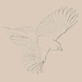
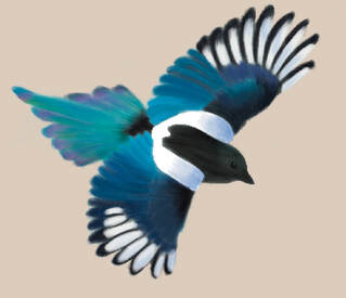
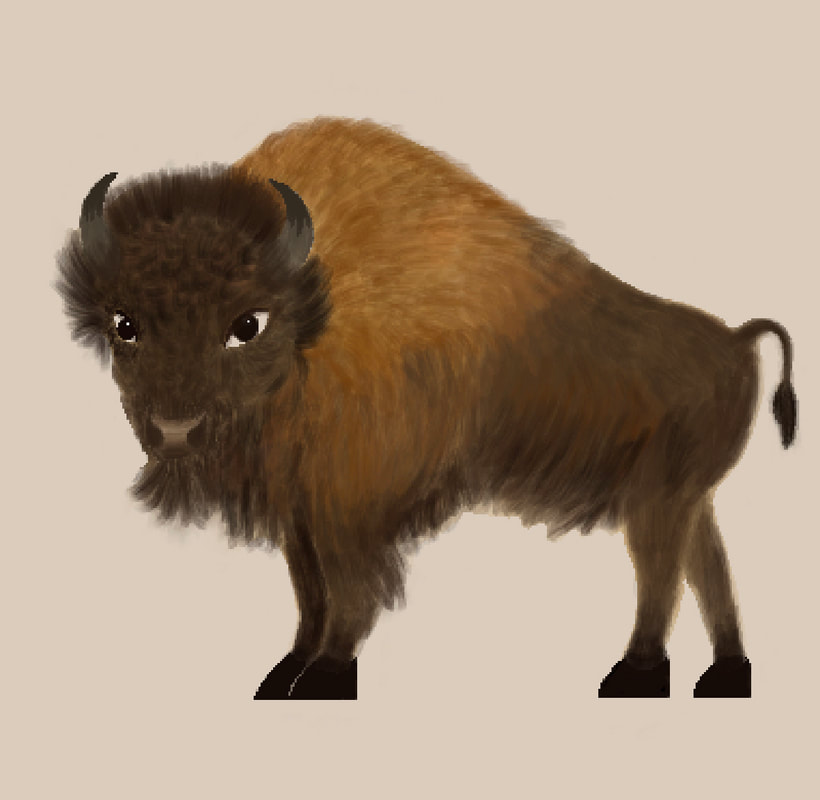
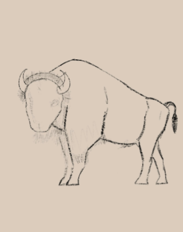
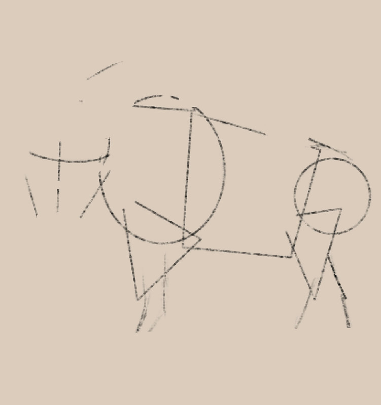
This past month I have completed the poster for the Hudson Bay Lowlands and am nearly finished with the Canadian Shield poster. I had a lot of fun revisiting Hudson Bay Lowlands and looked at pictures I took during my trip to Churchill and videos I took of Beluga Whales. I really wanted to capture the aesthetic of the subarctic zone properly and felt the best way to do so was to reflect on what I experienced on that trip. Another positive on that trip was the train ride up there. Churchill can only be accessed by train or plane, so we took an overnight trip on VIA Railways. There was a big window in our berth that gave us excellent views of the Canadian Shield, as well as sitting in the Skyline dome car. Due to it being a dome shape, the windows kind of warped the view but it was still pretty cool to see above the train and surrounding wilderness. In the early morning as the train approached Churchill, I saw a few Caribou antler sheds near the tracks, and then when we arrived, we learned a lot about how important the Caribou are to the Dene, Cree, and Inuit peoples who live there. Revisiting those memories, it solidified that I had to include a Caribou on the poster and I love how it turned out. I mainly used the acrylic brush and tried out a fine hair brush for blending purposes between the lighter strip and the dark brown across the body. Another animal that I absolutely had to include was a Beluga Whale. I had the opportunity to go kayaking in the mouth of the Churchill River that connects to the Hudson Bay. In the summer, the Beluga Whales migrate down south to Hudson Bay to bear their offspring. So I was able to see a variety of adults and babies. The adults are a bright white in the sun, and the babies start as a dark brown/gray and slowly lose their colour. Drawing and colouring it was quite easy for me as they dont have fur. They are just smooth so the blending was very easy to complete. The plants I chose to include, Fireweed and Labrador Tea, are important to me because they remind me of my grandmothers. I included Fireweed because my grandmother on my dads side grew up in Lynn Lake, a little town in the north of Manitoba. Fireweed is pretty prevalent up there and she always wanted to make it up to Churchill, and when she finally made it there last summer, she loved seeing the abundance of Fireweed and reminded her of Lynn Lake. I chose Labrador Tea because my grandmother on my moms side is an avid tea connoisseur. There is a trading post store right next to the hotel we stayed in, and they had locally grown and picked packets of Labrador Tea. So I knew I had to pick up a pack for my grandma. Drawing those plants was quite tedious but I like how they turned out. Fireweed is so vibrant with its pink and purple tones, but the shapes of the flowers and pre-blooms at the top were a bit hard for me to capture initially. Moving on to the Canadian Shield poster, I drew a Wolverine for the first time. It was a struggle with the anatomy at first and colour matching properly, but I think it turned out okay. It captured a more peaceful side as opposed to the usual pictures of them I see where they are aggressive and snarling. The Great Horned Owl was extremely tedious due to the patterns and speckles that run along the feathers. I did not have time to do the patterns perfectly one to one, so I simplified them a bit. But I think it looks okay because you cannot really tell when it is zoomed out and the full poster is in view. I’m looking forward to completing it and am trying my best to capture a woodsy feeling to unify it. I have got my first poster completed at the time of this blog. It encompasses animals of the Interior Plains, majorly including Alberta and Saskatchewan. I wanted to start with something familiar as my original project was only focused on Albertan native species. Getting used to the coloring, layering, and brush selection on Procreate has been good practice. My process starts out with the sketch, then line art, and then the coloring. I found that most of my time was spent in the coloring stage. The brush I used for most of the drawings imitated an acrylic paint brush, although sometimes I used the brush called ‘Syrup’ that has a much sharper edge for more detailed parts. Like the eyes or hooves. Most of it went well, but the two things I struggled with the most were the front-facing pose of the Pronghorn, and the Wild Roses. Since Pronghorns are prey animals, their eyes are located on the sides of their head, so capturing a front-facing image of them can look awkward, let alone trying to capture it in drawing formation. With the Wild Roses, I just haven’t drawn flowers in a while but I do not feel too bad about it as nature is not perfect, not all flower petals are totally symmetrical. The easiest one to complete though was the Blue-Eyed Darner, as I was able to use the symmetry tool on Procreate for both the sketch and lineart, it went pretty quickly. I think I had the most fun drawing the Magpie and the Bison. Drawing the fur on the Bison was satisfying in a way, and differentiating the dense vs long hair across its body. With Magpies, I love it when the sunlight catches on their feathers and they turn into an iridescent tone. I really wanted to capture the beauty of that sight. For my next poster, I am focusing on the animals of the Hudson Bay Lowlands. I’m looking forward to it as I was able to see quite a few of the species in real life during my Churchill trip. They are so fascinating, especially the Beluga Whales, so that is going to be the first animal to be drawn. I’m hoping to catch their playful and curious nature, as well as pay homage to the rest of the amazing animals of the Subarctic zone.
I think the art show went really well this year. I had a lot of fun with my friends and sharing my artwork. People were pretty intrigued with my skulls rather than disgusted. Of course I told anyone who asked that they were sourced ethically in case they did not see it in the artists’ statement. I am glad I had the chance to introduce people to an art technique that is not widely known. Overall pretty good for my artwork. As a group, I think it went well also, as I saw a lot of people coming from the drama and music productions browse around the artwork. Mostly everyone worked really hard on their projects, so it is good that they got recognition from many. If I could make any changes, it would be handling the easels better as the recently bought ones were very flimsy and made it difficult to transport the artwork to their spots while the canvases were tied to them. I don’t think I would change anything about my project itself, if I had wanted to do a different technique it would have been planned way in advance. As the way they look currently had to be planned much in advance due to the processes of whitening, pre-sketches, and finding the materials. I believe I have grown a lot in not just my artwork, but in my organization and planning skills as well. It made the project so much easier keeping track of my progress day by day and loosely planning deadlines. I will be sure to do that next year as I’m sure it will ease the project's timeline. For next year, I really hope I can put the skills I learned in VAM to use, especially the composition and hierarchy techniques as those will play a big role in my planned project. I feel I am already adept at the use of multimedia and colour theory, so I am not worried about that very much. All in all, a good year was had. And I am excited to bring my highschool career to an end next year with my last big VAM project. Thank you for reading.
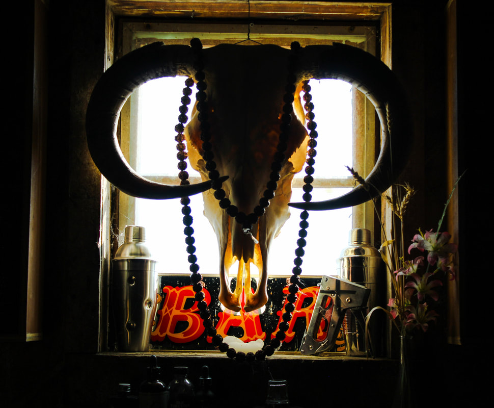
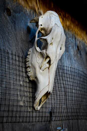
My independent project involves drawing and inking on animal skulls that have been ethically sourced. I collected them over the course of the summer and cleaned them up in dish soap and water, before bleaching them with a hydrogen peroxide mixture. As normal bleach would wreck the bone, the hydrogen peroxide whitens them without damage. The two deer skulls came from a farm that were found already deceased on the property. And the cow and female moose skulls were purchased from a licensed taxidermy business. They are the four main ones I am doing, but so far I am ahead on my pre-planned schedule, so I may end up bringing in a couple smaller pieces I haven’t finished yet which include a little deer skull cap and a deer scapula (shoulder blade). I may pass the rest of the time left with working on them and have a couple extras to display. For the main four skulls I have stuck to a theme of drawing insects on them, a Death's Head Moth, a Blue Morpho Butterfly, a Luna Moth, and an Atlas Moth. But for the extra pieces I may not stick to that theme completely as they weren’t part of my original project plan and are more personal pieces. My process involves creating a rough silhouette of the insect on a piece of paper to help me with the symmetry elements of the bug. After I do the outline and all the inner patterns, I ink it with some micron pens. After that I seal it with some matte modge podge so that the ink lasts on the bone for a long time. Then I decorated them with fake moss, florals, and real crystals that have colours corresponding to the insects on the skull. I have put in a slideshow containing some progress pictures for one of the deer skulls. I thought my best work shown in the celebration of learning was my photography. I just really like how the pictures turned out and fit together to create a story. With the small town horror vibes and apocalypse community themes, I enjoyed showing them to others. I feel like the show itself went really well and I had quite a bit more art to show than last year. There were a lot of people walking around observing the artwork. One thing I thought people were pretty interested in was the George Lucas sculpture projects, I kind of surprised myself with it. Because I was never that good with sculpting but I quite like how mine turned out. This semester I have grown a lot and expanded my skills. I became more confident in my painting and sculpting abilities and went out of my comfort zone. The painting was actually really fun to do with the bizarreness of the reference collage picture. My drawing skills have improved as well and I hope to get back into using my Prismacolours over the break and start practicing with colours again. All in all, a good time was had and I am looking forward to working on my independent project and the next celebration of learning.
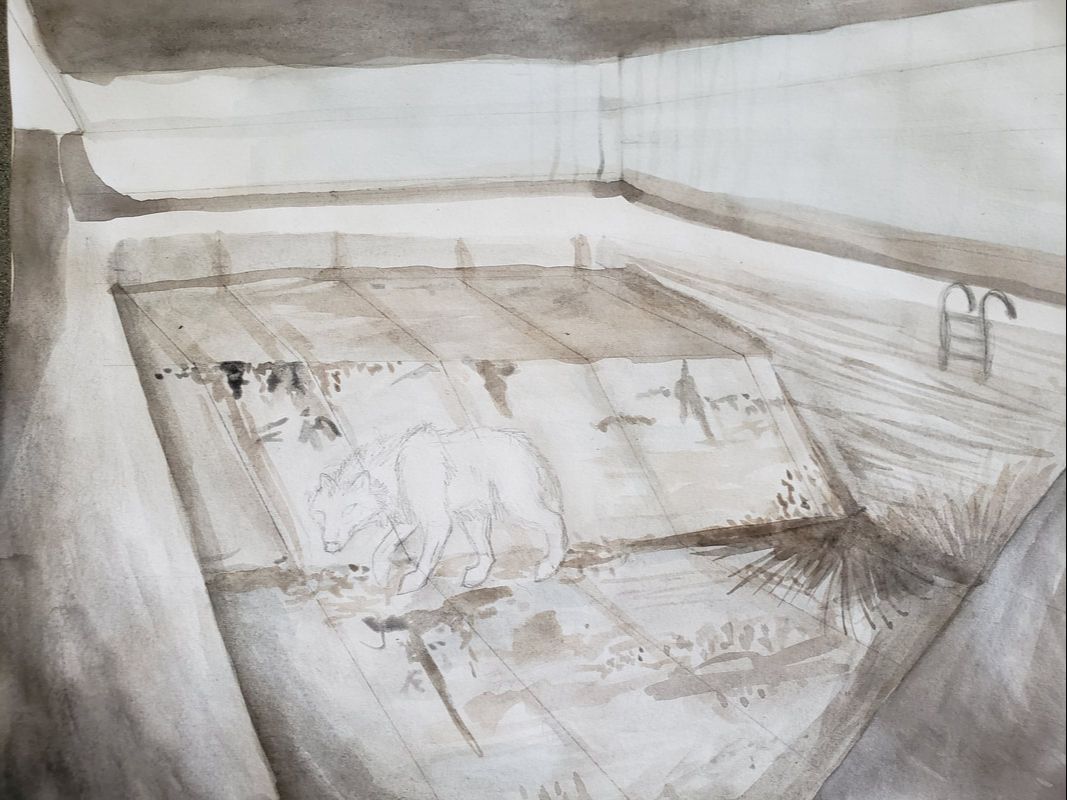
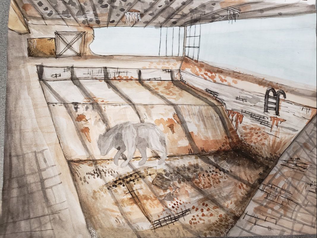
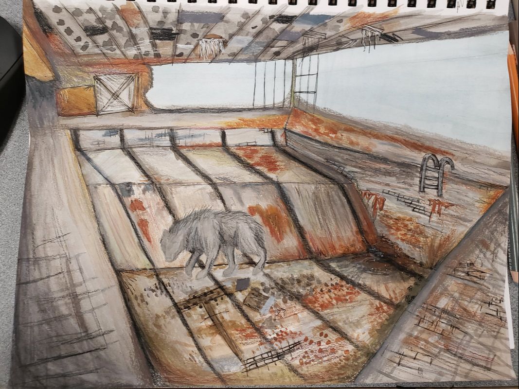
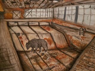
Personally, seeing other artists process videos and ‘work in progress’ updates is highly inspiring. Because every time I make an art piece I tell myself over and over again to trust the process so that I don’t abandon it. Knowing that most other artists' work have an “ugly stage” as well before they become masterpieces is important for me to understand. As I struggle with sticking to a piece till the end and go through the seven stages of grief in the process. Reminding myself to trust the process ends up working out because I usually like the final product. For this project it has been the same, I start off with messy pencil sketches and a few blotches of watercolour still unsure of it. But then I work through it and fill it in to make it vibrant and quality. The mixture and layering of mediums give them a lot of depth and flow. I start off with a sketch, then a couple layers of watercolour, then a little outlining with ink before I finish it off with a couple more layers with Prismacolours. It has been a bit of a challenge for me due to the fact that I hardly ever do backgrounds/buildings. But it’s been really good practice getting to figure out the elements that go with it. Like perspective, shading, depth, colours, and more. Of course I had to include a wolf in them to go with my theme/message, but also because I’m quite good at drawing them to balance it out. Between the difficulties of drawing architecture, getting to draw a wolf is like a reward. For this series I wanted an underlying message about human mistakes and nature. No matter how harsh we treat the earth, once we destroy ourselves, nature always reclaims what’s theirs. Throughout the process, I’ve thought about how abandoned buildings are very symbolic of humanity. Great structures show the development, strengths, knowledge, and creativity of us. And once they are left alone, they serve as a new foundation and shelter for nature and animals. I feel like I should try to do a good execution of those thoughts in this project. So that it can be impactful and thought provoking on others. Just to show others the dedication, thought, and work that goes into my artwork, and this series especially, I have included a snapshot of the process. For the very first piece I made, you can see the process in just a few photos here.
Personally, putting on the Celebration of Learning was a very nice experience. It was my first time doing a gallery sort of thing and I’m glad it went well. I was surprised at how organized yet quiet it was, however it was a pleasant surprise. In the future, I hope to do more galleries, as my first one showed me a glimpse of what it is like. I believe that the initial setup and getting prepared for it is quite stressful for everyone. There are deadlines and finishing things up and frustrations, but everyone pulled through in the end. And I think we put on a great show for everyone. Through the process, there were many compromises and a lot of extra time spent outside of school to finish things, but it was worth it in the end. If there was something I could change about my showing, I would definitely want to show more of my drawings. Most of the first assignments we did were photography related and then we did our painting paintings, so I narrowed it down to them. Other than that, I’m really satisfied with how everything played out.  |
|